C A S E S T U D Y - A C E O Y S T E R S
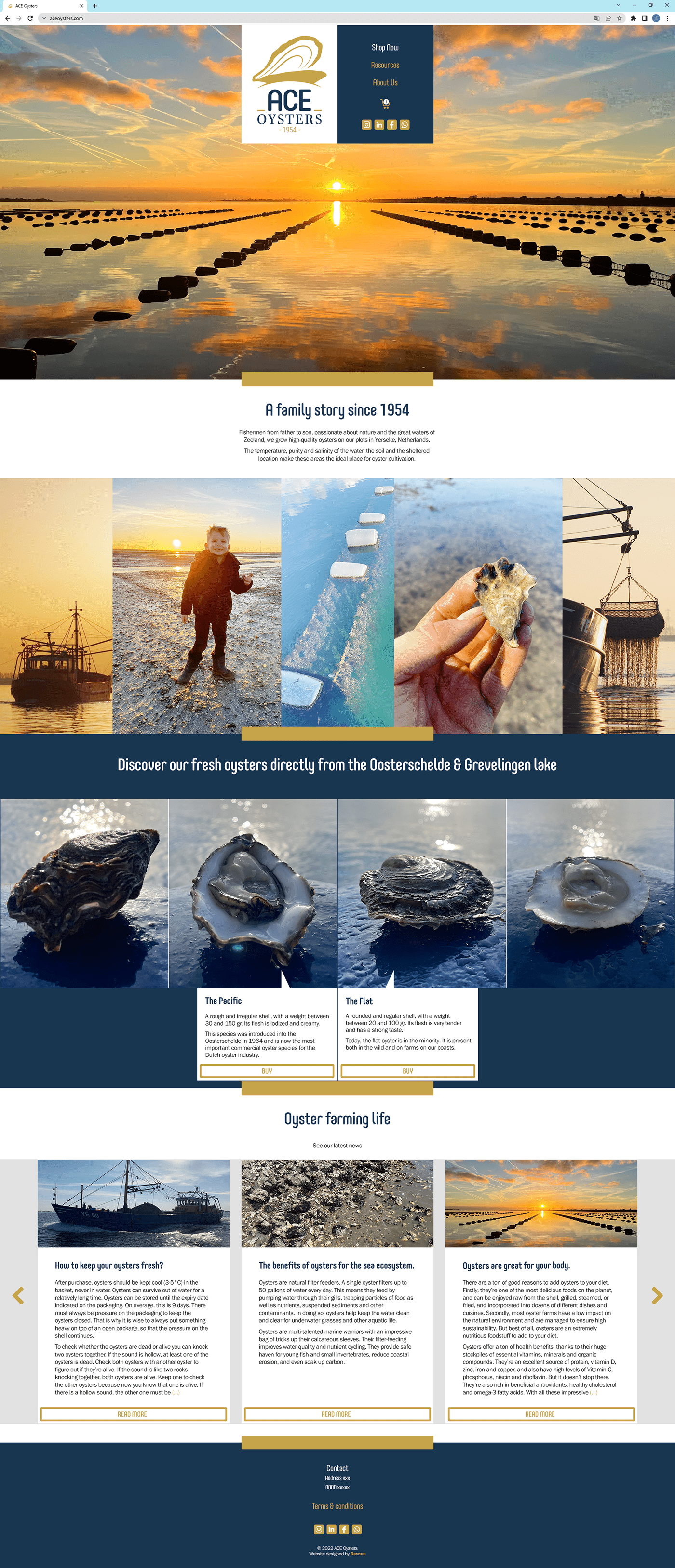
Ace Oysters is an online food company that needed a Logo, a Brand Guideline and an online shop.
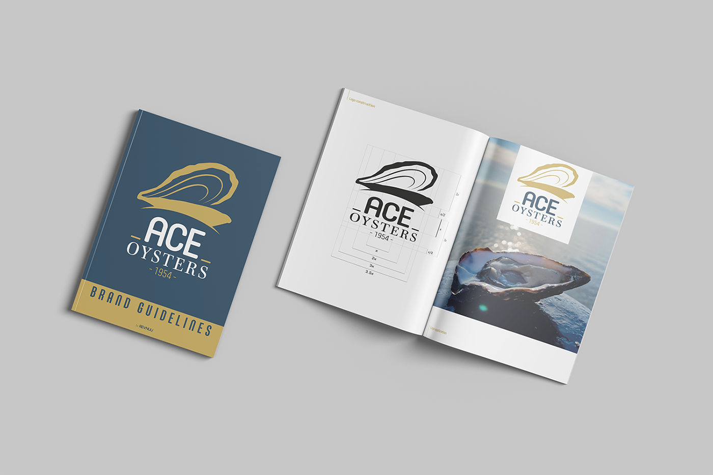
The logo had to have a modern feel with a traditional background, so the iconic, hand drawn and then vectorized image of an open oyster was complemented by two typefaces: a sans serif rounded one that gave it a modern feel, and a serif one that gave it the traditional roots. Gold and Dark blue colors were used to give it the premium feel that the client wanted to achieve, and a Brand Guideline document was produced.

The website was designed in collaboration with the UX specialist, achieving a classy, premium feel with a modern edge to it. To be able to make the purchase process as easy and fast for the consumer was crucial, and I took special care in having that part right.